Optimizing UX for Business Success: Cobb Technologies’ Website Redesign
Founded in 1990, Cobb Technologies is an independent business technology company headquartered in Richmond, Virginia.
Project Duration:
September 2021 to April 2022
Problem
Cobb has made a name for itself as Virginia’s #1 independent copier dealer, but they want prospects and clients to know they offer a suite of hardware and software tools.
Insight
Cobb Technologies has diverse offerings and a robust archive of content, but its website is out-of-date and not optimized to showcase neither its offerings nor content.
Opportunity
Redesign Cobb Technologies' website to reflect its diverse products and showcase its content in order to attract more inbound leads, positioning the company as a provider of comprehensive business technology, as well as a trustworthy educational authority in the business technology industry.
Role
I led the research, design, and implementation of the Cobb Technologies website, including writing and filming videos, shooting photos, and building the website in HubSpot. Additionally, I worked alongside a content strategist and was in charge of managing the project.
Toolkit

Google
Analytics

Google
Docs

Google
Forms

Google
Sheets

Hubspot

Microsoft
Teams

Semrush
Adobe
After Effects


Adobe
Illustrator
diagrams.net

Adobe
Premiere


Cobb’s Old Homepage
Internal Stakeholder Interviews & Product Definition
After meeting with Cobb’s President and Executive Leadership team, they concluded that success to them would mean:
A “modern” website that surpasses competitor websites both in ease of navigation and design
A website reflecting all their business offerings
A website that leverages Cobb’s existing content to gain more inbound leads.
The stakeholders wanted the project to prioritize:
The comfort of exiting clients. I was to ensure that whatever website elements I put forth would not be so different as to confuse existing clients.
Communication. All users must be able to easily contact or find contact information for Cobb Technologies.
Low bandwidth users. Cobb Technologies has clients and prospective clients in low-bandwidth areas. Users visiting the site from these areas must be able to access the full experience.
Desktop users. Google Analytics reflects that an overwhelming majority of users visit Cobb’s website via desktop computers, thus in the interest of time, stakeholders required us to design with larger viewports in mind.
Value Proposition Mapping
I created the UX value proposition map below as a framework to align stakeholders’ desires with UX activities and research exercises as they had never participated in redesigning a website.
Regarding communication and organization, the President of the company, and the Executive Leadership Team wished to meet every month to discuss progress made. Communication with all involved was done primarily over Microsoft Teams. I created and shared a Gantt chart to manage the project and keep all invested people abreast of where we were in the website development process.

We discussed past projects and existing constraints and determined that I would use Hubspot to host and build the website as Cobb was already using it to host their blog, run automated campaigns, and post on social media. Cobb had also used Hubspot to overhaul the website for their nonprofit arm, Imprint.
Research
Market Research
Competitor Website Audit
I selected a set of direct and indirect competitors that sell business technology, but the list of their offerings and the location of their operations varied. Below is a quick and basic summary of our findings:
Competitors’ strengths
Simple and straightforward user flow across the majority of the pages
Brand identity is consistent throughout
Competitors’ weaknesses
Visual design of competitor websites are largely outdated or overwhelming/confusing
User flow was intuitive, likely because the websites offered little content.
3/5 blogs made no use of tags
Brand identity while consistent is generic
E-Commerce platforms do not allow for checkout, only cart-building

What Can Cobb do to offer users a better website than its competitors?
Improve the visual design: create a website that is visually appealing and up-to-date. Invest in a more modern and intuitive design that makes use of current trends and best practices.
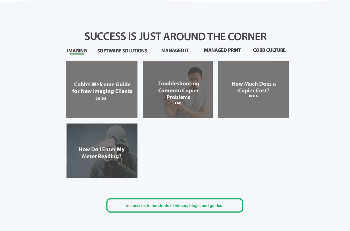
Offer more content: optimize existing media and provide more blog posts and videos that engage and inform users. Make it easier for these pieces of content to be found by having an internal search engine as well as tags. Improving Cobb’s SEO and making its content more discoverable will help target audiences to find the website.
Differentiate Cobb’s brand identity: Create a unique and memorable brand that sets us apart from generic competitor brands by positioning ourselves as an independent, non-biased business technology provider. Revisit Cobb’s established color palette and visual style and tweak it to better interest users.
Enhance the e-commerce experience: create self-selection tools including a seamless and straightforward checkout process. This will make it easier for customers to purchase products from your website, increasing conversions and sales.
Accessibility Considerations
Many of Cobb’s competitors’ websites overlooked essential accessibility features. In order to improve the overall user experience of the Cobb website, increase market reach, improve search engine optimization, and fulfill an ethical responsibility to provide an inclusive online environment, we will be designing the website to be accessible to all users. The following list includes points we will lend special attention to, as we found our competitors to be lacking in those particular ways.
Images should have alt text, and videos should have transcripts.
Structure the content using HTML5.
Employ descriptive headings.
Employ good contrasts, a readable font size that is magnifiable in the browser.
Publish all information in HTML format on web pages.
Use layouts that are intuitive, including large and easy-to-click buttons and CTAs, and forms that are clearly demarcated.
User Research
Personas
I conducted interviews with individuals in the sales department to understand what kinds of individuals they sell to. I then sought out willing clients and interviewed them to get granular information on their needs, desires, fears, and motivations, in order to distil that information into personas.
A large portion of Cobb’s business is imaging, however, they are hoping to increase their managed services sales. With this in mind, I created two personas - one focusing on imaging and document management (Margot), and the other on managed IT services (Todd).

Margot Stevens
Age: 64
Education: JD
Location: Norfolk
Family: Partner, empty nest
Occupation: Real Estate Attorney
“Campground rules: always leave things better than you found them.”
Goals
Spend more time helping her clients rather than working with her paralegal to find documents.
Prepare for retirement by digitizing her documents and making them easily accessible so her clients are left in good hands once she decides to leave the firm.
Margot is a partner at her firm, and she is loyal to her coworkers, however, she doesn’t want to field questions from them 24/7 during her first year of retirement. She wants to make sure her retirement is as easy on them as possible, and that she will be left alone to enjoy her free time.
Frustrations:
Margot went “all-digital” in 2010, but she has not back-scanned a majority of her documents, making it difficult to find anything before 2010.
Margot’s main concern is digitizing her files, but she doesn’t know how to pick a solution and would like someone to guide her through the process.
Margot likes the idea of digitizing documents but she’s concerned about the safety of the documents once they’re scanned.
Summary: Margot achieves a great deal of satisfaction from her job as a real estate attorney. She has been practicing for decades, and with that has accumulated paper documents and other physical media throughout the years. Now that she’s nearing retirement, Margot would like to leave her coworkers in a good place by making all her documents accessible to others who may need them. Once she retires, Margot would like to hike the Appalachian trail and the California Coastal Trail.

Todd North
Age: 37
Education: MBA
Location: Charlotte
Family: Spouse, 1 child
Occupation: CIO
“I want to be realistic, but I also want to make the most of this new opportunity.”
Goals
Find a managed IT company that can handle multiple locations.
Find a managed IT company that can manage both software and hardware.
Find a proven technology partner that he can trust to manage the day-to-day needs of his organization
Frustrations:
The internal IT department is small and Todd is concerned that the hiring process will take too long - he’s new to his position and there are many other fires to put out.
Todd’s company is expanding from two locations to five. Currently, consolidating the information from 2 locations is slow and aggravating, and he expects it to become worse once 5 locations open.
Todd is auditing his organization's various technology partners and would prefer to consolidate them all into one organization
Summary: Todd is the new CIO of a continuing care senior living community. His organization is expanding from two locations to five, and he was brought on to grow and strengthen the organization’s IT infrastructure and ensure that security, communication, and care do not suffer from growing pains. He is eager to make a good impression and believes that instead of directly hiring new employees for his internal team, outsourcing the IT will establish an immediate strong presence that is consistent throughout all the branches. Todd is coming from the world of startups, and he is a new dad, and wishes he could spend more time with his family and hobbies (marathon running).
User Journey Map
We wanted to better understand and empathize with our users, so we mapped both Todd and Margot’s user journeys. Todd’s aim was to discern whether Cobb appeared legitimate and robust enough to provide IT for his organization, and then reaching out for a quote. Margot’s goal was to schedule a meeting to speak with someone about document management, after having educated herself in the subject.
Through creating the user journey maps, I gained a deeper understanding of user needs, leading to some valuable opportunities including developing a chatbot to help users better understand their needs.
Affinity Map
I gathered a group of Cobb’s salespeople and asked the following question: How can we improve our website’s customer experience?
Summary of Needs
Appearance/Design: An up-to-date website that loads quickly and displays well across their devices
Layout/Organization: A website with straightforward navigation and intuitive layout
Communication: Various simple ways to get in tough with Cobb for both leads and troubleshooting
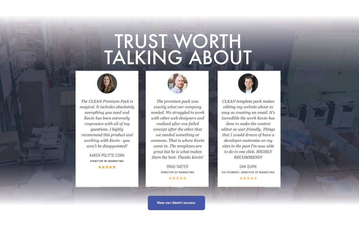
Credibility: Testimonials and awards that speak to the quality of Cobb's work
Education: Unbiased information that empower visitors to learn as much as possible and self-qualify before reaching out to Cobb
Insight Identification
Appearance/Design:
Modern design
Scalability
Fast load time
Information is current
Layout/Organization:
Quick journey
Simple navigation
Communication:
Live chat
Chatbot
Forms
Contact info
Credibility:
Testimonials
Awards
Education:
Blogs
FAQ
Content
Self-service tools
Design
Sitemap

Cobb’s website will contain large amount of interrelated content spread across multiple pages, so I created the sitemap using a hierarchical structure. Specific products, services, events, and educational piece of contents will be categorized and then divided into smaller sections. Laying out the website in a hierarchical format will ensure that users have an easier time navigating to what they need - they will find things faster, and encounter more relevant content. Furthermore, as Cobb’s website grows, the structure will allow for an easy, predictable expansion, benefitting users by minimizing growing pains.
Design System
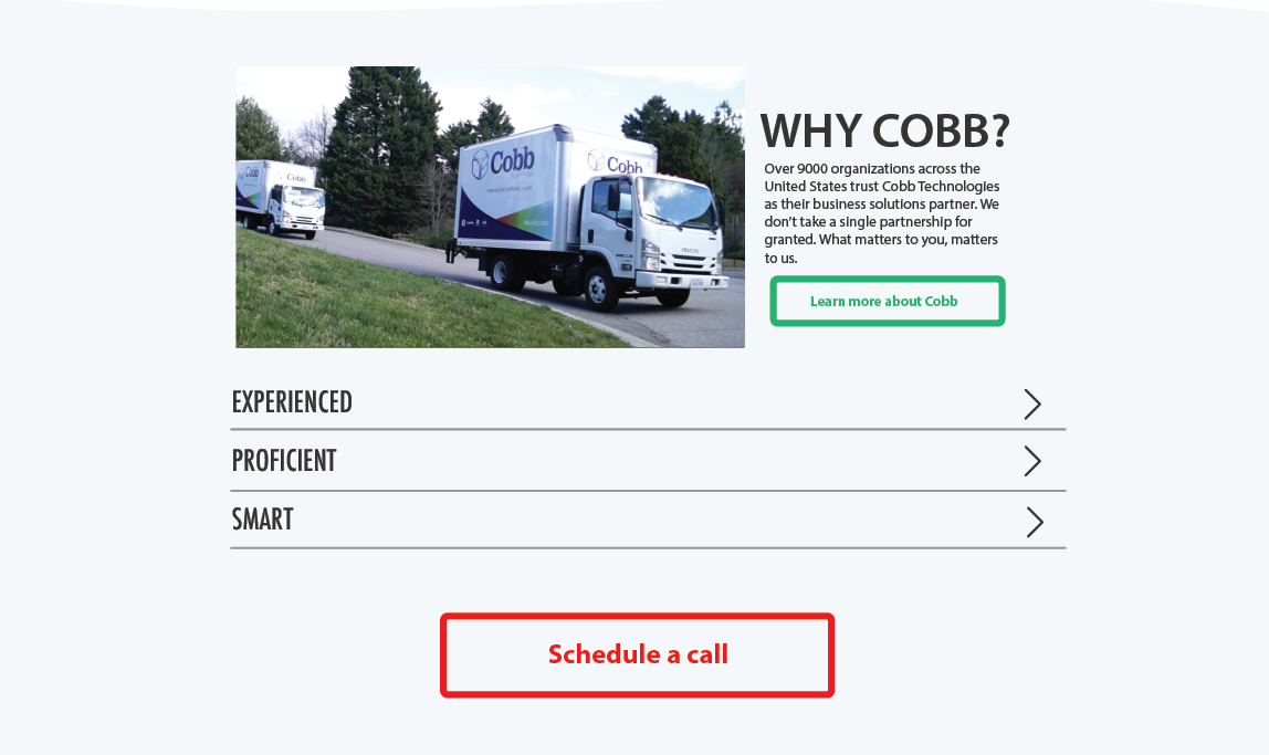
I needed to keep consistency in mind when creating Cobb’s design system. Cobb has been around for over 30 years, however, they had a rebranding in the mid 2010s, including a full wrapping of their fleet. I was conscious of Cobb’s physical presence, and ensured that their digital presence was complementary and holistically cohesive. The digital supports and enhances the physical, and vice versa.

I chose Tahoma and Arial. They are accessible, easy-to-read fonts that Cobb uses in their physical collateral, thus further bridging their digital branding and their physical branding.

The colors were selected from Cobb’s logo, but were made more cheery and lively by enhancing their brightness and making them more saturated.

Icons, buttons, and other assets were designed to ensure that each individual element is simple and distinct to help with identification. All assets created adapt well to different screen sizes and devices, and load easily in areas with low bandwidth.

Select Wireframes and Mockups
The stakeholders involved in this project had not developed a website before, and I anticipated there being some confusion in how they might conceptualize what the completed website would look like when reviewing the wireframes. In addition to presenting each section in detail, I bridged the extrapolation gap by providing more context within the wireframes, including fleshed-out headers, clearly-labeled buttons, and fully-realized forms.
The high-fidelity mockups adhere closely to the wireframes, but I used placeholder images as I was to gather visual assets only after having put the page together in HubSpot.
Rather than creating a prototype in Adobe XD or Figma, I began building the website directly in HubSpot. I subjected these unreleased pages to testing, just as one would with any other prototype.
Homepage

About Cobb

Contact Us

Document Solutions

Homepage Structure Walkthrough
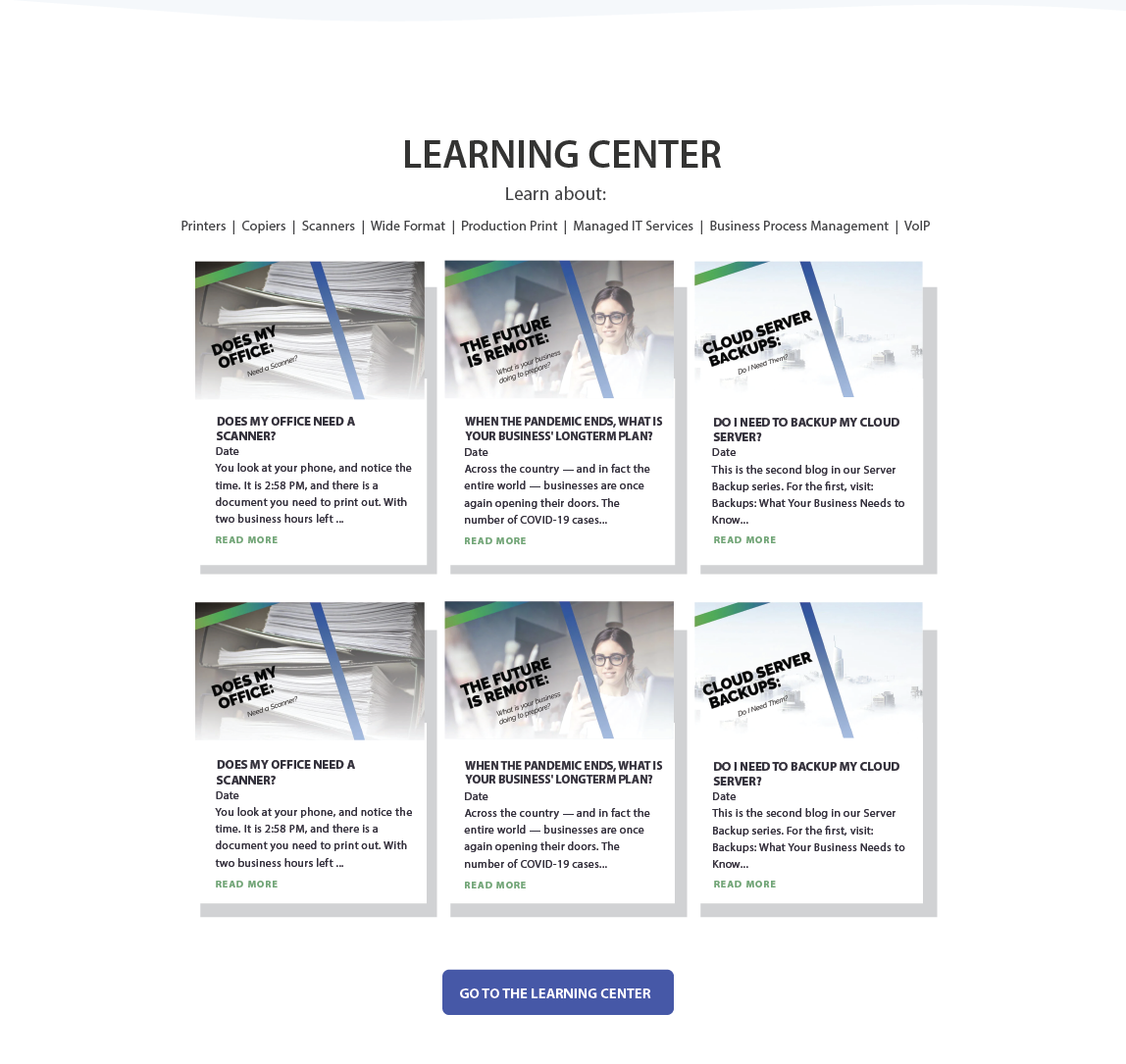
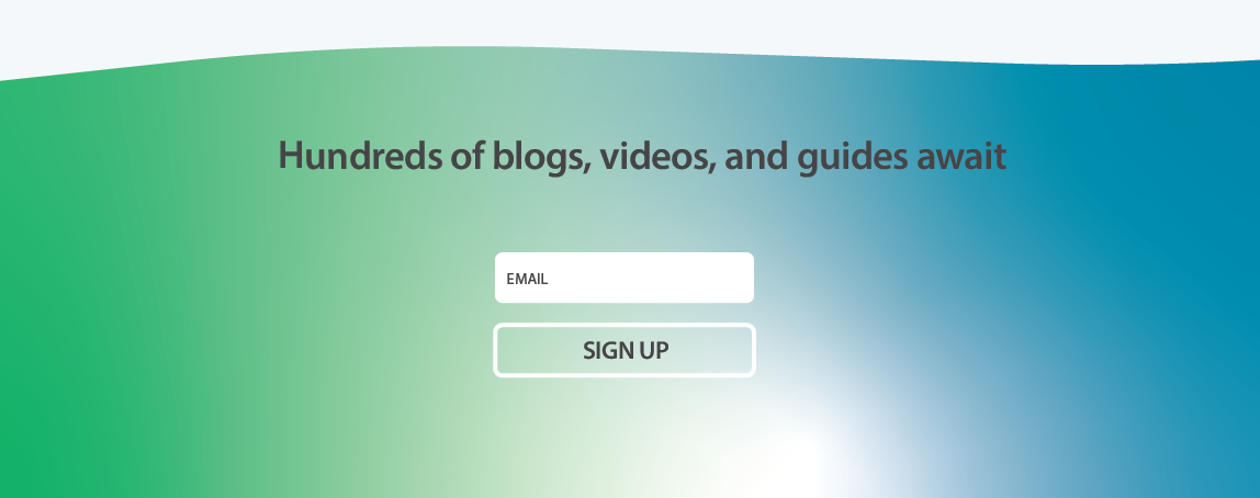
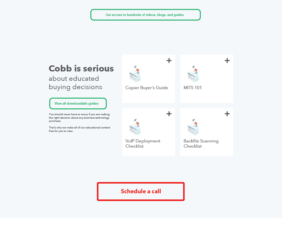
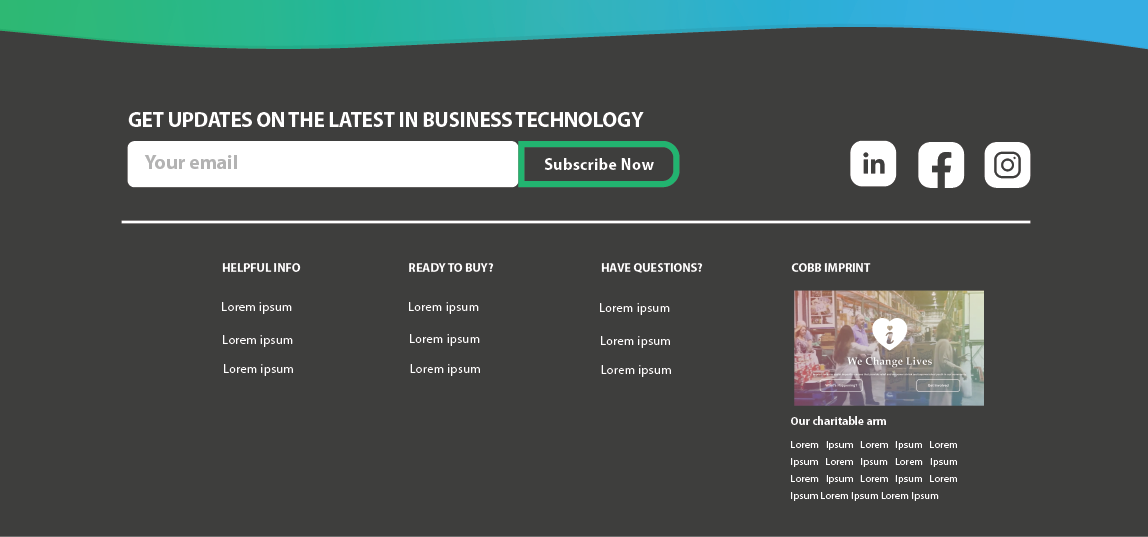
The homepage has been designed to provide a seamless experience to existing clients as well as new visitors.
Validation
Usability Study 1 Highlights
In-person. 5 users.
Objective: Contact Cobb about an existing equipment issue.
Users were confused about the primary navigation bar - they did not realize that the labels above the dropdowns were clickable.
Users were confused about the secondary navigation bar - they found the label “E-Info Login" confusing and they wanted explicit language detailing what could be done at the link - i.e. payment and service requests.
Solutions:
I added the label to the dropdown. Users are now able to access the page by clicking on either label.
I clarified the language in the secondary navigation bar.
Usability Study 2 Highlights
In-person. 5 users.
Objective: Learn about Cobb’s VoIP, and reach out to get a quote.
Users were frustrated at the VoIP page load time.
Users were (negatively) surprised that by clicking the “call now” button, their phones would immediately call Cobb.
Solutions:
I shortened the hero’s video background, lowered it’s resolution, and then made the hero’s gradient overlay darker to mask resolution issues.
I removed the “call now” button and replaced it with a “contact us” button.

Launch
Introducing the website internally
Cobb's Sales Team uses the content on Cobb’s website as part of their assignment selling strategy, so it was imperative that they understand how to locate valuable content quickly and easily on the website. Cobb's Account Managers also use the content library to help educate client on processes. Knowing this, Cobb had a launch party to review the website and discuss the new tools available to their employees. I also provided employees with an anonymous form they could use to anonymously lodge complaints or make suggestions.
Results
Cobb’s new website was rolled out gradually, beginning in April of 2022 and ending in June of that same year; pages were published in order of importance. The data in this section compares the second half of 2022 to the second half of 2021. Business technology follows a cadence, and by comparing Jul-Dec 2022 to Jul-Dec 2021, I am able to provide a more level examination that takes into account the seasonal variables of the industry.
Organic Traffic
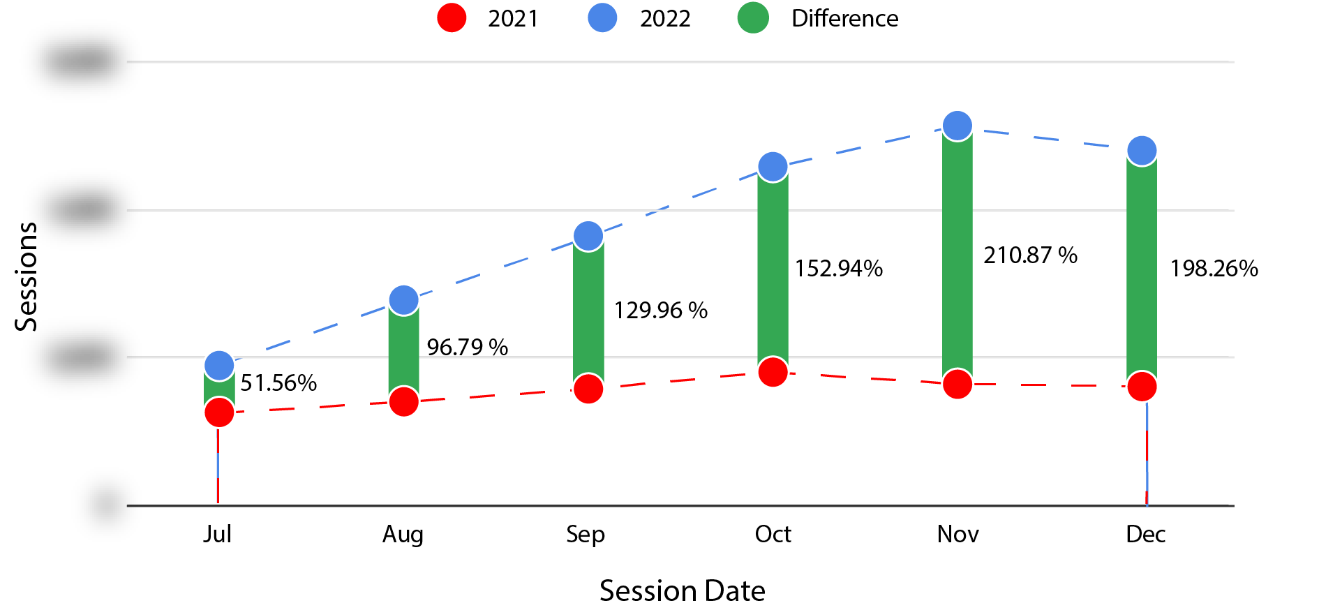
Cobb’s organic traffic increased dramatically, indicating that the redesign was successful in improving the website's search engine optimization. By making it more user-friendly and engaging, improving the load speed, and optimizing its content for relevant keywords, the website became more discoverable by potential customers.
Direct Traffic

Cobb experienced more direct traffic after their website redesign. We can surmise from this that the website's new design and improved user experience have created a positive impression among users, leading them to revisit the website more frequently.
88% increase in total traffic
157% increase in marketing leads
16% increase in page views to form submissions rate
582% increase in new contacts
218% increase in average time per page view
14% decrease in bounce rate
Iterate
Next Steps
Improve Cobb’s mobile experience
Emphasize Cobb’s multiple Virginia offices, and build each office’s presence within the website by highlighting their individual strengths.
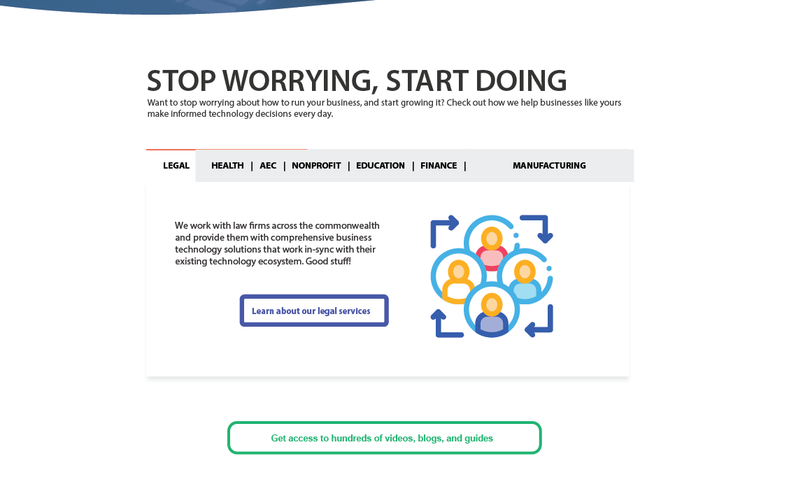
Make pillar pages for each vertical outlining how Cobbs services can and have been successfully applied to companies in their respective industries.
Collect more client testimonials and spread them throughout relevant pages.
Create an e-commerce experience allowing users to customize and buy equipment and services.
What Was Shelved?
The chatbot was limited to information geared towards existing clients, such as directing users to the client portal.
Cobb has not restarted their webinar programming, so the webinar section of the homepage was greatly abridged.
There were concerns over creating self-selection tools, such as an e-commerce feature, so the plan was suspended.
Gathering case studies for different industries was complex, so the industry pillar pages have been postponed.


